PROJECT: INFOGRAPHIC ROUTE MAP
CHALLENGE: To design a travel infographic for a group of young individuals travelling to India for the first time.

PROCESS/RESULTS: Designed a travel infographic for use within various travel sites such as Travel-one. Knowing how visual we all are, the use of this graphic solution gives one quick information.
Color Process:
A color scheme is one of the first elements to communicate the message behind the design on both visual and psychological levels. In fact, the color scheme is one of the most important elements. This is because, when used correctly, color can reflect the niche and even the overall business marketing strategy.

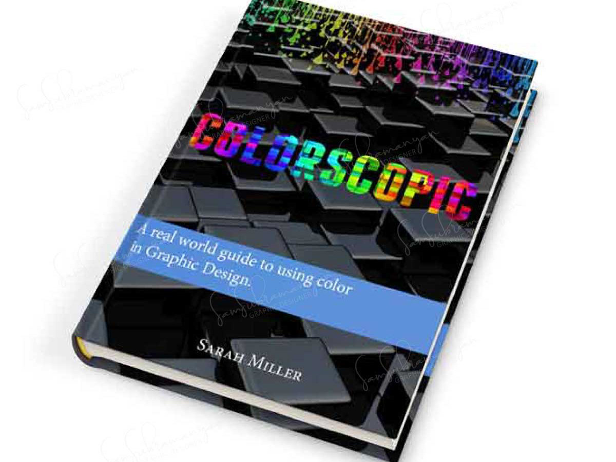
Primary colors have a major impact, especially when they are used together. They are clear, straightforward and bold.
Here, paler tints of primary colors are used. The colors really come into their own when used collectively, which is a sure-fire way to channel a summary or vintage vibe in the design. The colors used have just enough white mixed into it to look subtle and soft while maintaining its colorful personality. The colors come alive when used with a very nearly black charcoal gray background.
Here, paler tints of primary colors are used. The colors really come into their own when used collectively, which is a sure-fire way to channel a summary or vintage vibe in the design. The colors used have just enough white mixed into it to look subtle and soft while maintaining its colorful personality. The colors come alive when used with a very nearly black charcoal gray background.
TOOLS: Sketched using Adobe Illustrator and refined to suit requirements.
OUTPUT: Used for digital web solutions but can easily be adapted to a PDF format for print.